

Links inside li that take up all the space


Let's say you have a set of navigation links inside an li. Those links all have a hover state that changes the background colour. As you hover across each of them, you want the right edge of one hover state to be up against the left edge of the next hover state, with no gaps between them.
Set up
Here's our HTML for this:
<div>
  <ul>
    <li><a href="#">Link 1</a></li>
    <li><a href="#">Link 2</a></li>
    <li><a href="#">Link 3</a></li>
    <li><a href="#">Link 4</a></li>
  </ul>
</div>
I haven't added any classes so the CSS will be easier to understand: we'll be treating each li and each link the same.
The div around all of this is there so it's easy to change the total size of everything without having to do any browser resizing. I'm also using it to pretend there's some other things in the nav, maybe the logo, that makes it taller than 16px. I've also used it to move our nav away from the edges a bit.
And the CSS:
div {
  margin: 1em;
  width: 350px;
  height: 100px;
  outline: 1px solid black;
}

ul {
  margin: 0;
  padding: 0;
}

li {
  display: inline;
  list-style-type: none;
}

a {
  border: 1px solid red;
}
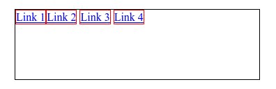
I've used borders so it's easy to see what's going on.
At the moment it looks terrible:
The obvious thing to do is to add padding.
Padding
If we add padding to the links then that gives us a bigger clickable area, which is not going to be a bad thing.
a {
  border: 1px solid red;
  padding: 2.45em 1.29em;
}
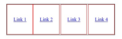
At this point the links overflow the div vertically. We can fix this by adding display: inline-block to the links:
a {
  border: 1px solid red;
  padding: 2.45em 1.29em;
  display: inline-block;
}
And that fits, more or less:
However, there is a problem. You can see what it is if you change the div width from a small 350px mobile to a bigger 400px mobile:
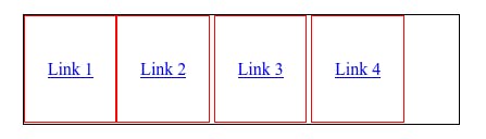
You could instead make the padding a percentage, so it will always fill the width of the div. Except you're going to be there a while working out the numbers and there's an easier way. Which also fixes the problem of that gap between the links.
Flexbox to the rescue
The easier way involves flexbox. Let's remove the padding on the links, as we won't need it once we've finished and instead add a display flex to the ul:
ul {
  margin: 0;
  padding: 0;
  width: 100%;
  height: 100%;
  display: flex;
  justify-content: space-between;
  align-items: stretch;
}
Adding width: 100% and height: 100% to the ul means it will take up all the space in the div.
Then we can use space-between to space the links out across the whole width. And by aligning items stretch we can make sure the lis fill the height.
It now looks like this:
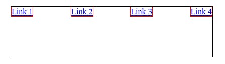
Which is still unhelpful. But we can then update the li to make it take up the whole width:
li {
  display: inline;
  list-style-type: none;
  border: 1px solid green;
  width: 100%;
}
I've added a green border around the li so it's easier to see what's going on.
So it now looks pretty good:
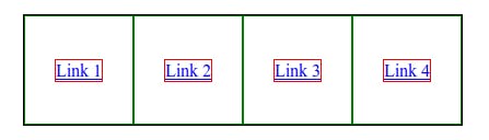
If we were to remove all those borders that would look like what we wanted. Except that we want a hover state on the links. Let's add that in:
a:hover {
  background: grey;
}
Except this isn't what we want:
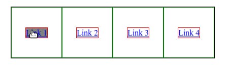
What we actually want is for the space the li is taking up to go grey when we hover on the link. But if we did that, any user would think that they can click anywhere in the grey area to visit the link. So we need the link itself to fill that space. Which we can do by making sure the link fills the horizontal and vertical space.
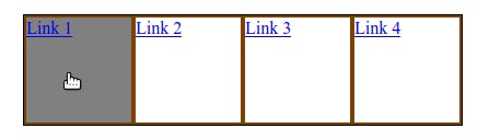
We can easily make the links fill the li by setting their width and height to be 100%:
a {
  border: 1px solid red;
  width: 100%;
  height: 100%;
}
This is looking better:
Now all we need is to centre those links. May as well use more flexbox:
a {
  border: 1px solid red;
  width: 100%;
  height: 100%;
  display: flex;
  justify-content: center;
  align-items: center;
}
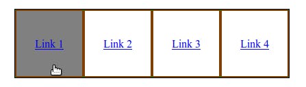
Now it looks good!